
Two Column Content Module - PS
Module Setup Guide
Thank you for choosing our module. Here is a quick getting started guide.
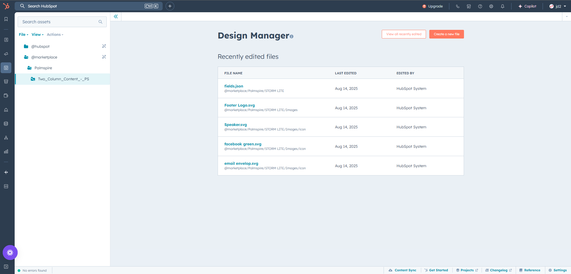
1. Locating the Module in HubSpot
Once installed, the module will be available in your HubSpot account:
- Open the Design Manager.
- Go to the folder: @marketplace › Palmspire › Two Column Content - PS.
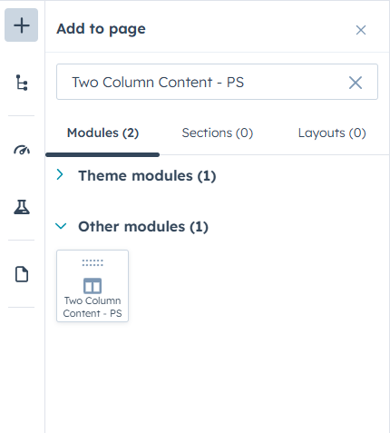
2. Adding the Module to a Page
Our modules is independent and can be used on any HubSpot page, regardless of the theme you’re using (including themes from other providers).
- If you’re working within a theme, simply open your page in the editor. In the left sidebar, click the Add (+) icon to open the module library.
- In the search bar under Add to page, type the module’s name. For example, if you’ve installed the Two Column Content - PS module, type Two Column Content - PS to locate it quickly.
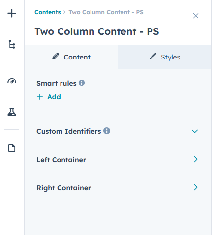
3. Module fields structure
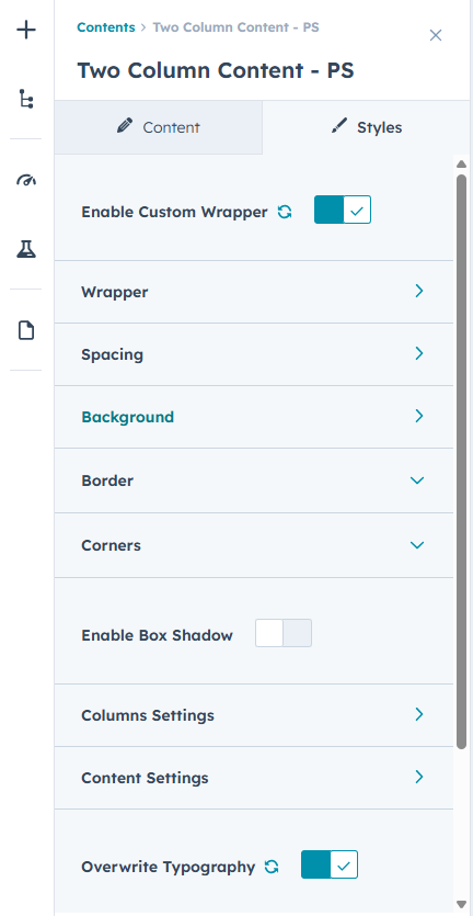
There are two major tabs for module fields. The Content tab and the Styles tab.
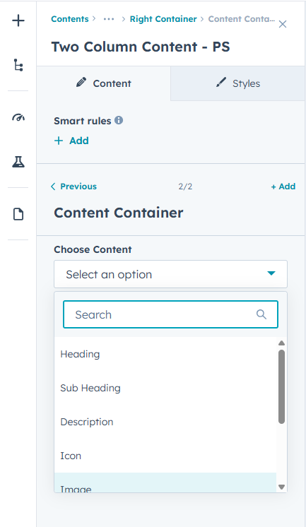
- Content Tab - The Content Tab is where you find the module contents and layouts that you can use, such as headings, subheadings, icons, images, videos, buttons etc.
- Styles Tab - The Styles Tab allows you to customize the look and feel of the module, including enabling a custom wrapper, adjusting spacing, setting background colors, adding borders and rounded corners, applying box shadows, and modifying column and content styling. You can also choose to overwrite global typography settings and fine-tune fonts, sizes, and colors directly within the module.
You can arrange the elements in any sequence within each column to create unique layouts that suit your brand.
4. Understanding the Module Layout
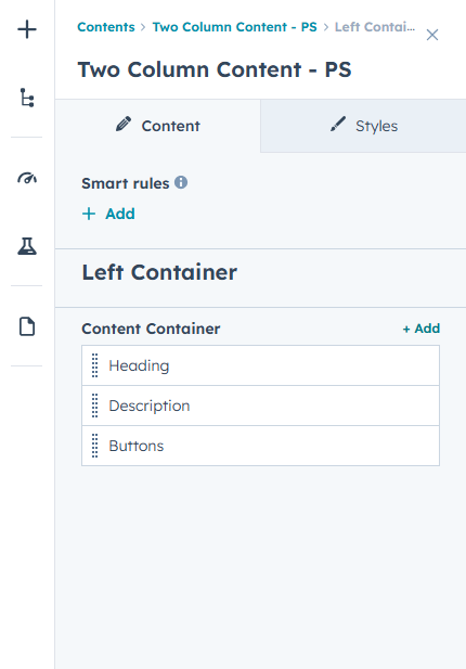
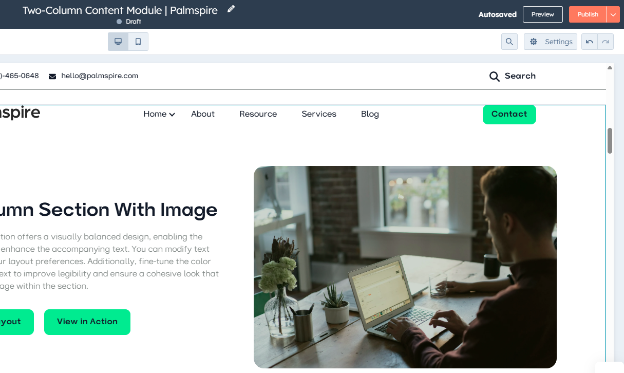
The Two Column Content - PS module is made up of two fully customizable containers:
- Left Container – Can contain headings, subheadings, text, lists, icons, images, videos, and buttons.
- Right Container – Offers the same options as the left container, allowing complete flexibility.
You can arrange the elements in any sequence within each column to create unique layouts that suit your brand.
6. Publishing Your Page
Once you’re happy with your layout:
- Click Publish in the page editor.
- View your page to ensure all content displays as expected on desktop and mobile devices.
6. Tips for Effective Use
- Keep a visual balance between the two columns for a clean, professional look.
- Use contrasting background colors or images to distinguish sections.
- Mix media and text strategically to keep users engaged.
- Place CTAs in prominent positions to maximize conversions.
Need help ?
If you have any questions or need customization support, please contact our team.
Email us at hello@palmspire.com
For any inquiry reach at https://palmspire.com/contact-us